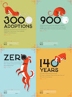
Jessica Hische's work can be found in mutiple mediums and different places all over the world. She is not only a general graphic designer, but also is known for being a letterer and illustrator. After going to the Tyler School of Art, and being a free lance designer, she landed a job with Louise Fili. There, she expanded her talent of creating unbeliveable letterforms, making identies for restuarants, wine companies, etc. She has gotten an aray of different opportunites, never really doing the same type of project. From book covers, to posters, to magazine spreads, to identies Hische has dabbed in on a little bit of everything. At the age of 28 years old now, she is still illustrating for the New York Times, Tiffany and Co, People Magazine and other huge companies that get her name further out into the world. Free lance seems to still kepp her moving on and side projects keep on coming.
What is the take away from the video?
First and foremost, I couldn't believe that a women still in her 20's had gotten her name out into the design world as much as she already has. Jessica seems to be the type of designer that will try a little but of everything. If she gets asked or contacted by an art director or agency, chances are she will go ahead and do that project for them. Her diversity of mediums really makes me think even more about how graphic design is not limiting or restricting. However, Jessica also made a good point. She said something along the lines that "if you don't have an illustration of a christmas tree on your portfolio, you won't be asked to ever design something with one in it." Even though that opinion can be true sometimes, and not other times, I went away with something because of that line. What I took from that statement is that if you don't want to design, draw, make something in your future jobs, don't cover your portfolio with it. Also, still have a diverse portfolio but if you aren't wanting to focus on dvd covers for instance, don't put 50 different covers you've designed in a porfolio. Moving on, I like how Jessica made working in a design office seem like a vacation almost. It was definitely a different outlook than what I've heard from other designers. She talked of getting to watch hilarious cat youtube videos, and being a crazy cat lady, she found it to be something that she was so lucky to get paid for. She made working for hours and hours on design work seem light and fun. That boosts my spirit just a bit, to know that once I find my certain niche in the real world, I can have fun with it even if it's stressful and chaotic at times. Her work, especially her illustrations which are whimsical most of the time, inspire me as well. And just like professors have said already and what Jessica actually does, I love how she always combines her illustrations with her own handmade letter forms. Even though I have not tried that aspect of design that much yet, after watching the video, I plan on giving it an attempt in a personal project.
Summarize the designer: Fili
Before starting her own design firm, Fili worked for Pantheon Books as an art director in the late 70's until the late 80's. There she was inspired to start on her own, a companly that would not only do book design but much more. In 1989 Fili founded Louise Fili Ltd. Jessica Hische of course is one of her most memorable and famous designers that worked at a junior then senior position. A lot of the type creations that are found on Fili's websites are from the work of Hische herself. Fili's design studio has clients that desire a variety of different things. On top of book covers, jackets, and spreads, there is also a focus on logos, packaging, and restuarant identities. Fili is known for her letterforms as well, and their elegant, swift quality. I get a sense of how life used to look like between the 50's and 70's when I look at her work. There is so much detail taken into consideration for each piece. Even the book covers seem to never waste white space. Her designs flow all over their compostion, no matter if it's a poster, book jacket, or restuarant design. Her strong use of lines and shapes makes me want to experiement with patterns that are simply just those two things. Even her logo for Louise Fili Ltd shows off her many years of experience with type. The curves are beautiful, especially for the uppercase L's. She takes letters and makes them look like fonts that came from years ago, but really are truly original to her and her designers' styles.


No comments:
Post a Comment